Remote Work and the Coronavirus

Written by Roberto Gallardo and Richard Florida
Roberto Gallardo is assistant director of the Purdue University Center for Regional Development and a Purdue Extension specialist. He is the author of Responsive Countryside: The Digital Age and Rural Communities.
Richard Florida is University Professor at University of Toronto’s School of Cities and Rotman School of Management, Distinguished Fellow at NYU’s Schack Institute of Real Estate, and co-founder of CityLab. He is author of The Rise of the Creative Class and most recently of The New Urban Crisis.
Introduction
In the wake of the coronavirus crisis, large segments of the U.S. workforce have shifted to remote work. The history of similar pandemics like the 1918 Spanish Flu indicates that they occur in waves. Even as the first wave of the crisis ends in a couple of months, we need to ready our workforce and our communities for a protracted period of protecting ourselves as we battle the virus. That means that a substantial share of Americans will be working remotely for the foreseeable future. Surveys and polling data suggest that more Americans desire to work remotely in the wake of the current health crisis. And we can expect an increased share of the workforce and companies to remote work as they realize the cost-savings and other benefits.
But not all workers and communities are equally prepared for remote work or e-learning. Studies have found not all jobs/occupations are remote work friendly and internet access among school districts vary significantly. Two factors in particular affect workers’ ability to work remotely in their communities. The first is the availability of ubiquitous, adequate and affordable digital connectivity, which varies widely across the country. The second is the share of jobs that can be done via remote work. This too varies across the country, with remote work amenable jobs concentrating in large metros and tech hubs.
How ready are America’s communities for the new realities of remote work?
To get at this we looked at two factors: 1) the availability of digital connectivity and/or 2) the share of workers employed in industries and occupations that are amenable to remote work. We focused on how vulnerable counties are by looking at the places that have inadequate digital connectivity—including access to the internet and devices—and places where a higher share of workers are employed in industries/occupations that are not remote work friendly.
If a particular county has both limited digital connectivity and a higher share of non-remote work workers, it will more than likely struggle to leverage e-learning and remote work. We looked at the geography of remote work across America’s 3,000 plus counties.
Here are some key dimensions of our analysis.
Limited digital connectivity
We divide counties into five equal groups or quintiles in terms of internet and device connectivity based on three variables: 1) percent households with no internet access or relying solely on cellular data to access the internet (Int1); 2) percent households with no computing devices or relying solely on mobile devices to access the internet (Int2); and 3) percent population with access to no providers or access to up to 10/1 advertised speeds only (Int3). The data source was the 2014-2018 ACS 5Yr. and the Federal Communications Commission Form 477 December 2018 v1 version.
Remote work potential
To get at the potential for remote work, we identified several occupations and industries that overall engage less in working from home. In regards to occupations, we calculated the share of workers employed in service, natural, construction, maintenance, production, transportation, material moving, and military specific occupations (Occ) and in regards to industry, we calculated the share of workers employed in construction, manufacturing, wholesale, retail, transportation and warehousing, utilities, and government, including armed forces (Ind). Again, counties were divided into five equal groups or quintiles using data from the 2014-2018 ACS 5 Yr. survey.
You can search for your county/state in the interactive map at the bottom and see the percentages on the right-hand side of each of the five variables utilized. Also, Census tracts are available if you zoom into a particular county. Click anywhere on the map to see the variables for a specific county/tract.
We end up with data on 3,103 counties, after consolidating Virginia’s independent cities and counties and removing Rio Arriba County in New Mexico due to insufficient data.
We labeled counties with a high vulnerability if they placed in the fourth or fifth quintiles in all five variables listed (see table 2 for quintile cutoffs). Counties were labeled with a moderate vulnerability if they placed in the fourth or fifth quintiles in 3-4 of the five variables utilized. Counties were labeled with a low vulnerability if they placed in the fourth or fifth quintiles in 1-2 of the five variables listed. Lastly, counties with no vulnerability were those that did not place in the highest quintiles in none of the variables analyzed.
Important to keep in mind is that although counties may have been labeled no or low vulnerability does not mean they are not vulnerable. All counties had a percentage of their population or workers with low digital connectivity and/or employed in non-remote work friendly jobs/occupations (see Figure 2 below).
Table 1. Top Ten Counties with Lowest Digital Divide Index Score
| Vulnerability Type | No. Variables in Highest Quintiles (4 & 5) |
|---|---|
| No | 0 |
| Low | 1-2 |
| Moderate | 3-4 |
| High | 5 |
Source: Purdue Center for Regional Development
As Table 2 shows, a high vulnerability county would have the following characteristics: a 42.6% or higher share of households with no internet access or relying solely on cellular data; a 37.6% or higher share of households with no computing devices or relying solely on mobile devices; a 28.5% or higher share of population with no providers or access to only up to only 10/1 advertised; a 53.6% or higher share of workers employed in service, natural, construction, maintenance, production, transportation, material moving, and military specific occupations; and a 50.9% or higher share of workers employed in construction, manufacturing, wholesale, retail, transportation and warehousing, utilities, and government (including armed forces) industries.
Table 2. Variable description and quintile cutoffs
| Name | Description | 1 | 2 | Quintile 3 | 4 | 5 |
|---|---|---|---|---|---|---|
| int1 | Percent households with no internet access or relying solely on cellular data | <24.6% | <30.2% | <35.5% | <42.6% | <84.2% |
| int2 | Percent households with no computing devices or relying solely on mobile devices | <21.4% | <26.6% | <31.2% | <37.6% | <69.9% |
| int3 | Percent population with access to no providers or up to 10/1 advertised only | <1.5% | <5.4% | <13.1% | <28.5% | <100% |
| Occ | Percent workers employed in service, natural, construction, maintenance, production, transportation, material moving, and military specific occupations | <42.3% | <46.7% | <50.1% | <53.6% | <75.6% |
| Ind | Percent workers employed in construction, manufacturing, wholesale, retail, transportation and warehousing, utilities, and government, including armed forces industries | <38.7% | <43.2% | <46.9% | <50.9% | <82.6% |
Source: Purdue Center for Regional Development
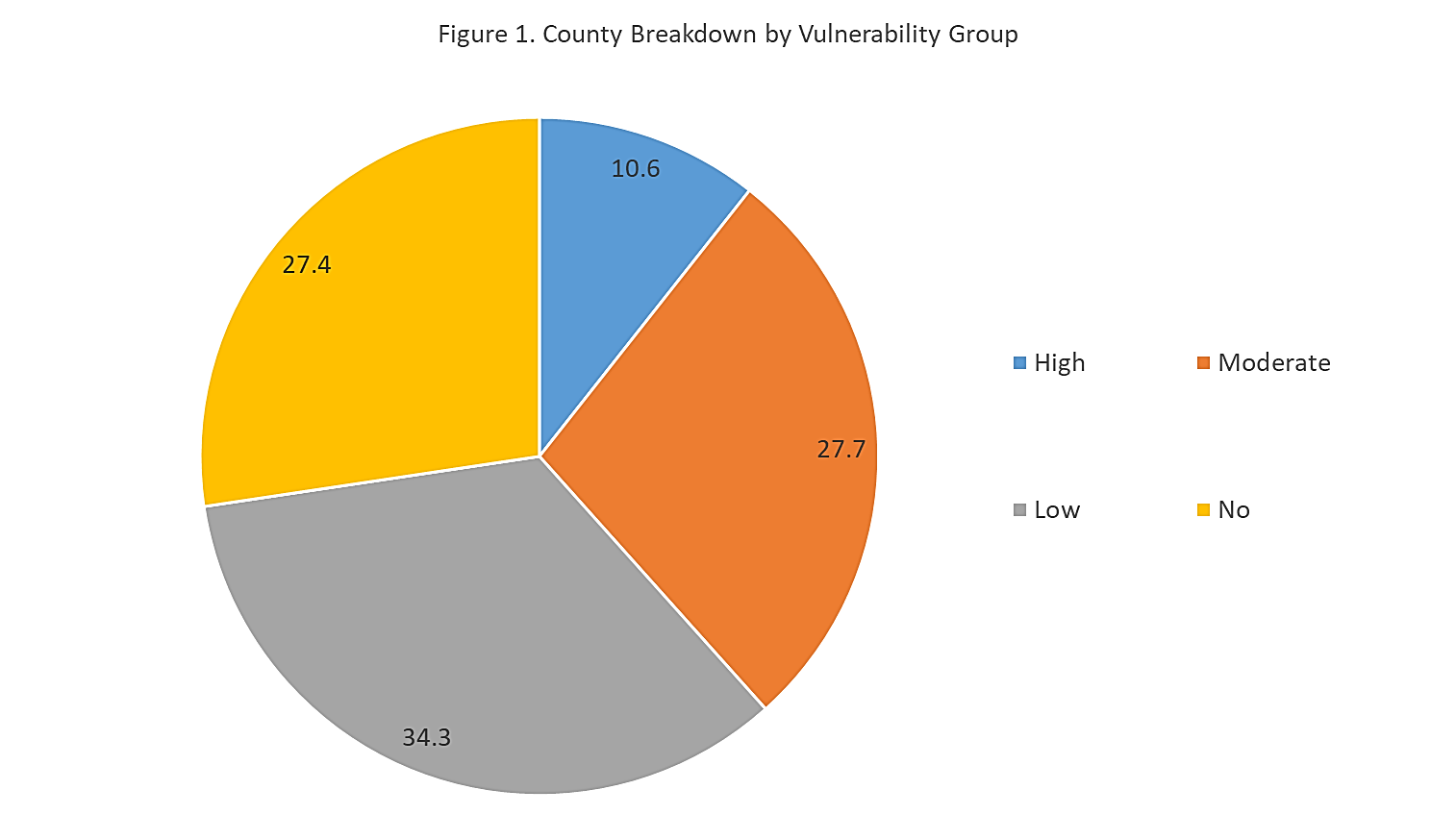
Figure 1 lists the share of counties with no, low, moderate, and high vulnerability.
No vulnerability
Roughly one-quarter (27% of counties or 849) have no vulnerability to implementing the virus outbreak mitigation strategies. Therefore, their students and workers may weather this virus outbreak better compared to other counties.
Low vulnerability
Roughly one-third of counties (1,063) have low vulnerability to the outbreak since they placed in the highest quintiles in 1 or 2 of the variables analyzed. In other words, for the most part they will be able to implement the mitigation strategies.
Moderate vulnerability
A bit over one-quarter of counties (861) placed in the moderate vulnerability category. These counties will have a harder time implementing the virus outbreak mitigation strategies since they placed in the highest quintiles in 3-4 variables analyzed.
High vulnerability
Roughly ten percent (330) fall into the high vulnerability category. These counties will have a very hard time implementing the mitigation strategies recommended. This means their social distancing efforts will be undermined placing their students and workers in distress during this outbreak.
Source: Purdue Center for Regional Development; ACS 5 Yr. 2014-2018
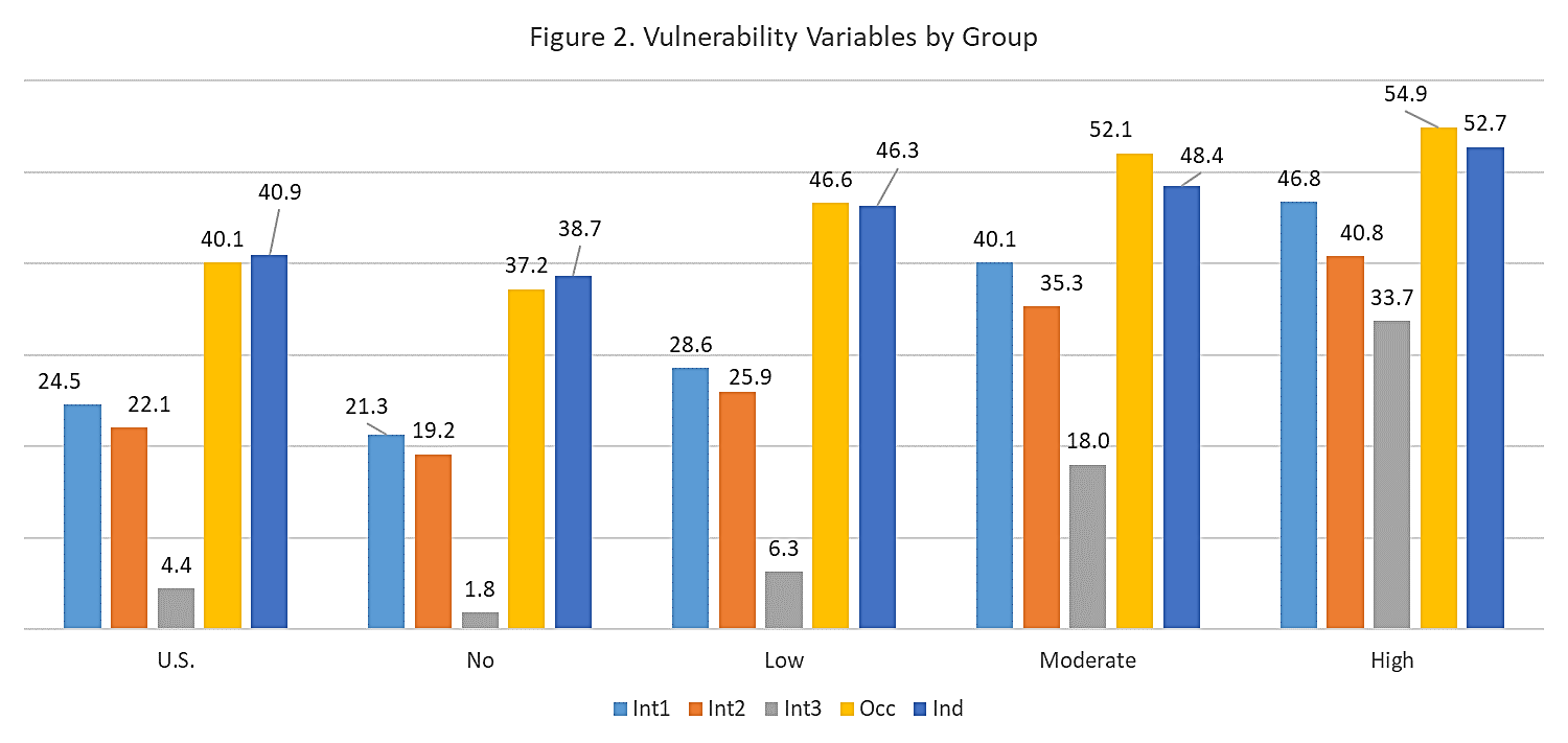
Figure 2 shows each vulnerability group and the average for each of the five indicators utilized. For a detailed description of each variable name please refer to Table 2. As expected, the overall percentages in the high vulnerability group were much higher compared to all other groups. For example, 52.7% of workers in the high vulnerability counties were employed in construction, manufacturing, wholesale, retail, transportation and warehousing, utilities, and government, including armed forces industries compared to 38.7% in the no vulnerability group and 40.9% overall in the U.S.
Important to note as well is that the no vulnerability counties still had percentages of their population and workers that will struggle when implementing these containment strategies. Consider for example that close to one-quarter of homes (about 18.2 million) in the no vulnerability category had no internet access or relied solely on cellular data for internet access while a little over one-fifth of homes (about 16.4 million) did not have computing devices or relied only on mobile devices to access the internet. These homes and workers will struggle when these containment strategies are implemented even though they live and work in no vulnerability counties.
Source: Purdue Center for Regional Development; ACS 5 Yr. 2014-2018; FCC form 477 December 2018 v1
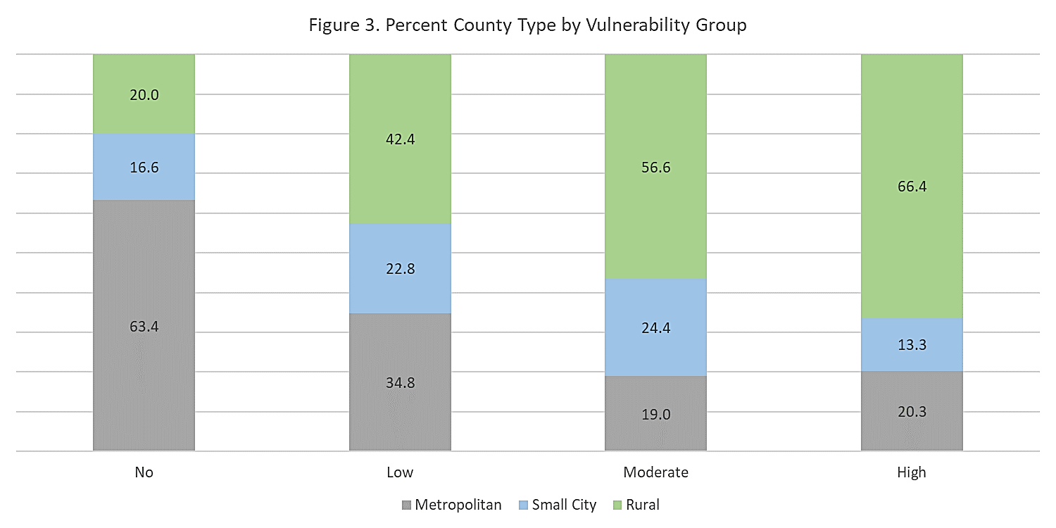
County Type
Figure 3 breaks down the vulnerability groups by type of counties using the urban influence codes developed by the United States Department of Agriculture Economic Research Service. This typology groups counties into twelve different categories ranging from large metros with 1 million or more residents to noncore not adjacent to metro or micro areas without a town of at least 2,500 residents.
Roughly two-thirds of counties (63.4%) with no vulnerability were large/small metro areas compared to one-fifth of the high vulnerability counties (20.3%). On the other hand, two-thirds (66.4%) of counties with a high vulnerability were rural counties.
Source: Purdue Center for Regional Development; ACS 5 Yr. 2014-2018
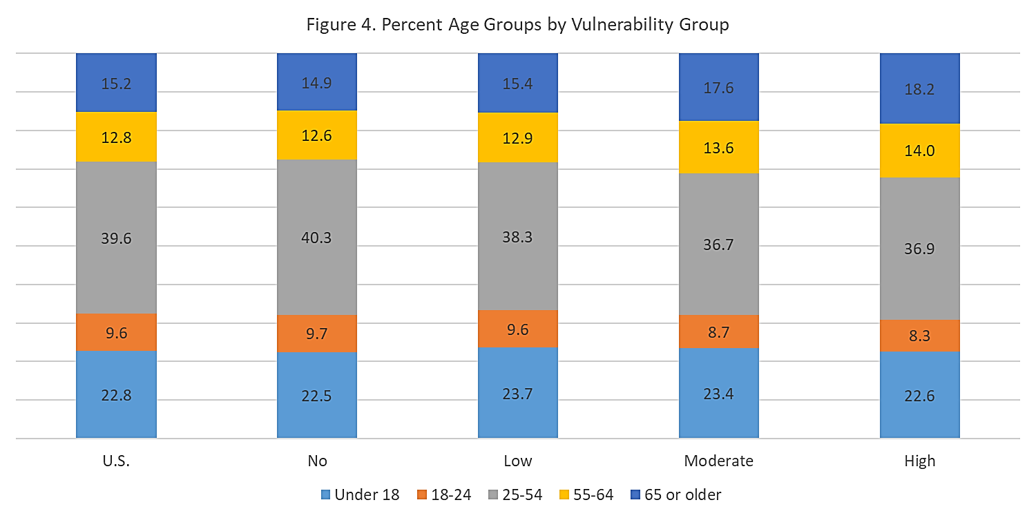
Age Groups
Figure 4 breaks down the data by age groups. It shows a slightly higher share of those ages 65 and over in counties with a high vulnerability (18.2%) compared to those with no (14.9%) or low (15.4%) vulnerability. In addition, about one-fifth of residents (22.6%) in high vulnerability counties were children (under 18).
Source: Purdue Center for Regional Development; ACS 5 Yr. 2014-2018
Race and Ethnicity
Figure 5 breaks the data by race and ethnicity. It shows that a higher share of White Non-Hispanic residents lived in high vulnerability counties compared to 58.5% living in no vulnerability counties. The share of minorities was higher in no and low vulnerability counties compared to areas with high vulnerability.
Source: Purdue Center for Regional Development; ACS 5 Yr. 2014-2018
Income
Figure 6 shows the share of household in each of the vulnerability groups by annual income. Close to one-third of homes in no vulnerability counties made $100,000 or more per year compared to 13% in counties with a high vulnerability. On the flip side, 43.5% of homes in high vulnerability counties made less than $35,000 per year compared to 27.2% in counties with no vulnerability as defined by this study.
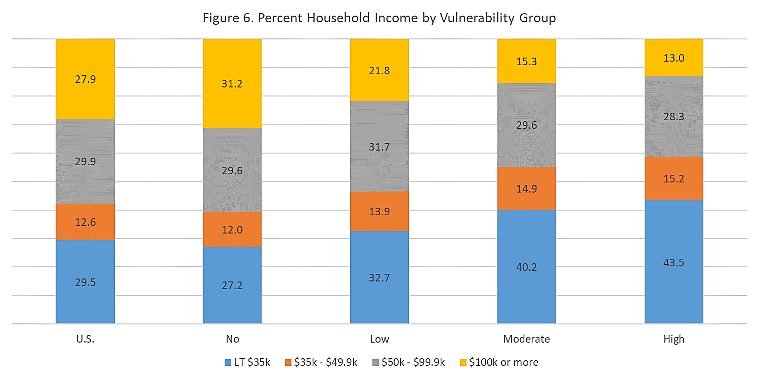
Source: Purdue Center for Regional Development; ACS 5 Yr. 2014-2018
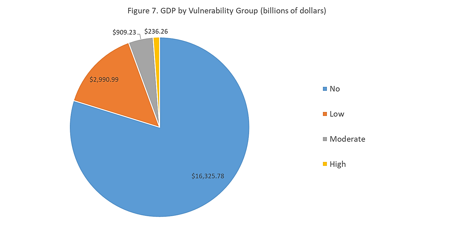
Gross Domestic Product
Figure 7 shows the gross domestic product (in billions of dollars) for each of the vulnerability groups. The cumulative GDP of no vulnerability counties was a little more than $16 trillion compared to $236 billion of high vulnerability counties. Although it may seem that the economic impact could not be that high, keep in mind that economic multipliers and supply chains affect all vulnerability groups.
Source: Purdue Center for Regional Development; Bureau of Economic Analysis
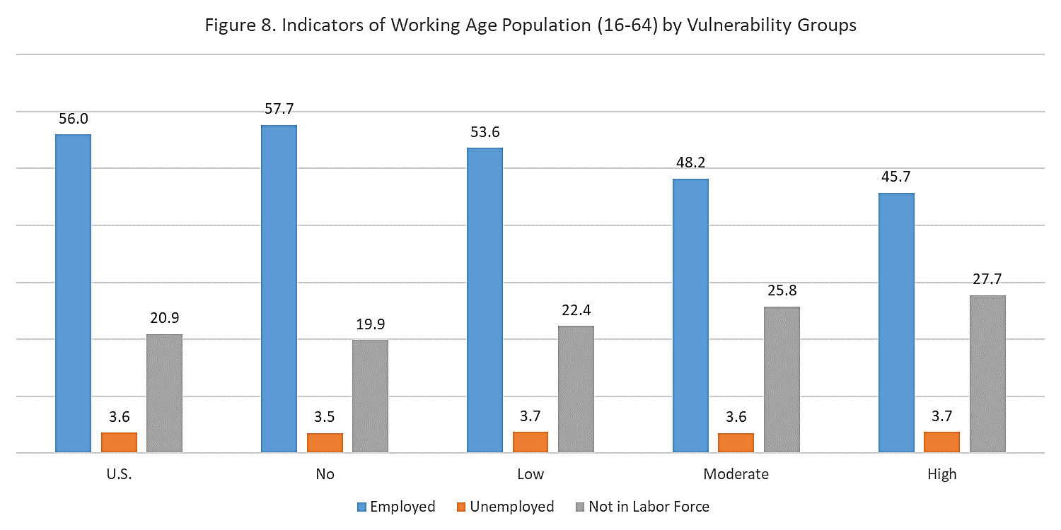
Unemployment and Not in the Labor Force
Figure 8 shows that high vulnerabilities counties had a lower employment rate among those ages 16 to 64, a higher unemployment rate, and a higher share of those not in the labor force.
Source: Purdue Center for Regional Development; ACS 5 Yr. 2014-2018
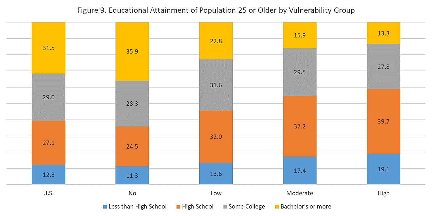
Educational Attainment
Figure 9 shows that roughly one-fifth of those ages 25 or older did not have a high school degree in high vulnerability counties compared to 11.3% in no vulnerability counties. On the flip side, the share of those with a bachelor’s degree or higher was three times higher in no vulnerability counties compared to high (35.9 versus 13.3%).
Source: Purdue Center for Regional Development; ACS 5 Yr. 2014-2018
Conclusion
The coronavirus crisis has ushered in an unprecedented shift to remote work. Millions across the country are using their digital technology—computers, laptops and phones—to work from home as this crisis unfolds across the nation and the world. But just as our country suffers from economic and spatial inequality, so too do we suffer from inequality in which kinds of places are most prepared for remote work and which are most vulnerable.
Our analysis looked at how America’s more than 3,000 counties are able to implement remote work in terms of two key variables—how limited their digital connectivity is (including access to internet and devices) and those that have a higher share of workers employed in industries and occupations least amenable to remote work.
Nearly forty percent of counties had moderate to high vulnerability to remote work (27.7% moderate and 10.6% high vulnerability) compared to more than 60 percent which had lower vulnerability (34.3% low vulnerability, 27.4% of no vulnerability).
The counties that are best positioned for success with remote work are more urban, have larger economies, more educated workers, and higher incomes. Conversely, those that are most vulnerable are smaller, more rural, suffer from high rates of unemployment and have less educated workers.
That said, even the least vulnerable places across the country have some percentage of residents and workers who are not well suited for remote work, who suffer from inadequate connectivity, and work in occupations or industries that are far less amenable to remote work.
Keep in mind that the ability of employers to deploy a remote work system (e.g. telework policies, telework mindset and culture, information technology, etc.) was not factored in this analysis. This is a critical element to keep in mind when gauging effectiveness of remote work strategies. Likewise, the ability of school districts to deploy e-learning varies, even among districts that have adequate connectivity.
Remote work and the challenges and inequities it brings will be with us for a while. Pandemics like the current coronavirus unfold in waves lasting 12 to 18 months. During that time, many of us will continue to engage in remote work. And even after, many may continue to do remote work as a growing number of workers value its flexibility and a growing number of firms realize that it can save them money. It is also likely to benefit large congested cities by reducing traffic and enabling the conversion of some office space into residential uses.
To conclude, it is important to remember that remote work is part of the broader challenge of economic and geographic inequality. As we shift to more remote work, it is important that mayors, economic developers, community leaders, businesses, unions, and workers develop strategies to make remote work as inclusive as possible and undertake efforts to ameliorate the economic and spatial inequality that it reflects.
Having trouble viewing the map? View in new window.

Roberto Gallardo is the Vice President for Engagement, Director of the Purdue Center for Regional Development and an Associate Professor in the Agricultural Economics Department.... read more